Compare page · Techjockey · Shipped · 2 min read
Compare pages that line products up like-for-like
How do you make a side-by-side comparison honest when every product is described in its vendor's own words?
I specced Compare 2.0 and 3.0: alternatives suggested as you add products, rows that line up only what is comparable, a "best use for" view of who each product suits, and one lead action per product. Compare was the third page of the revamp that took organic conversion from 2% to 4.5%.
 (opens full size in a new tab)
At a glance
- Organic conversion, across the category, product and compare pages
- 2% → 4.5%
- Inorganic conversion, same three pages
- 6% → 12%
- Role
- Product Manager · User pod lead
- Context
- Shipped at Techjockey
- Format
- PRD · desktop + mobile web
- Stack
- GA4 · Google Search Console · PageSpeed Insights · Figma · Jira
The problem
A compare page answers "this one or that one?". But products came with feature lists in each vendor's own words, rows often had data for one product and not the other, and the page ended in two competing buttons, so buyers comparing two products had no single next step.
What Compare 2.0 and 3.0 changed
Start from the first product
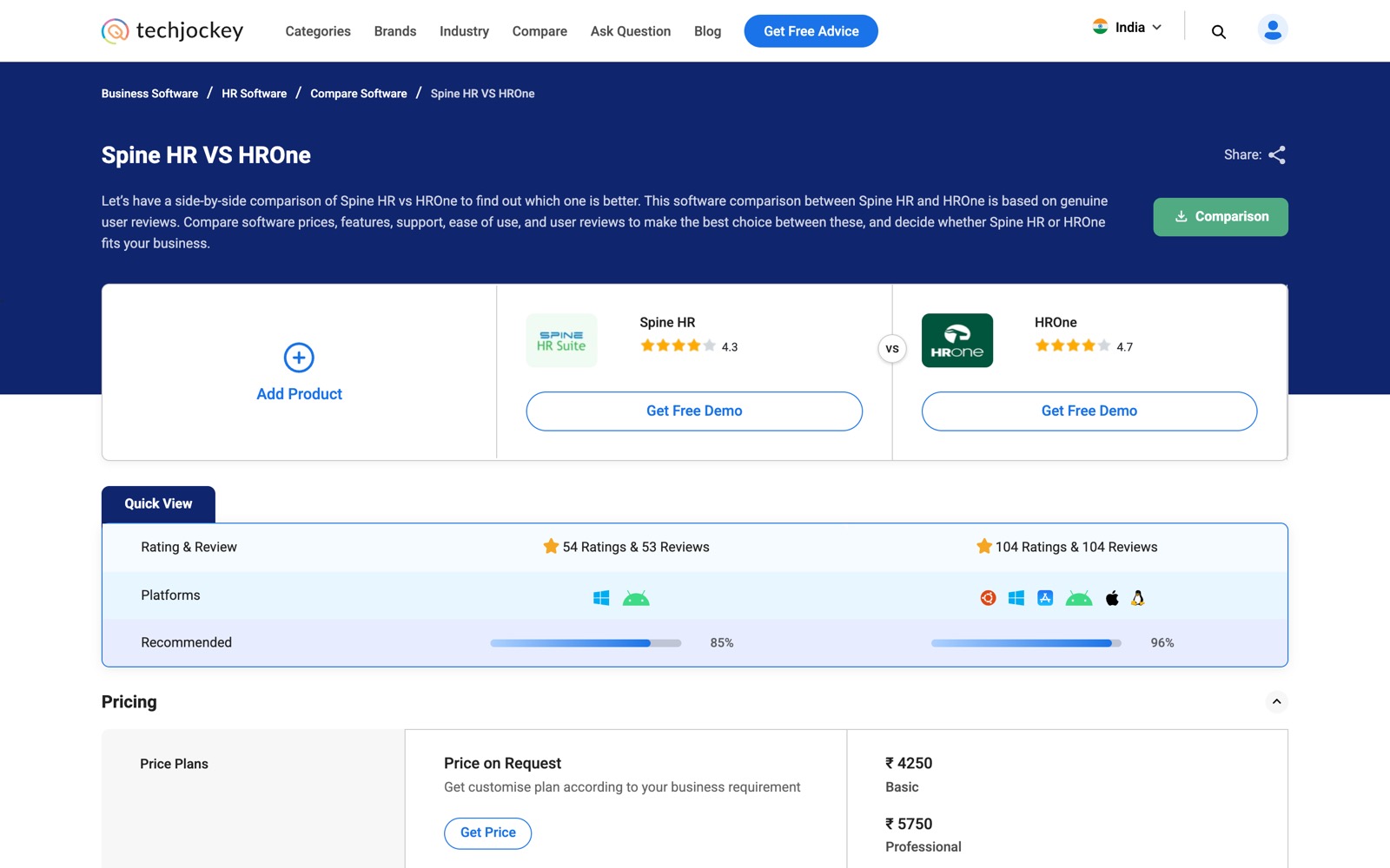
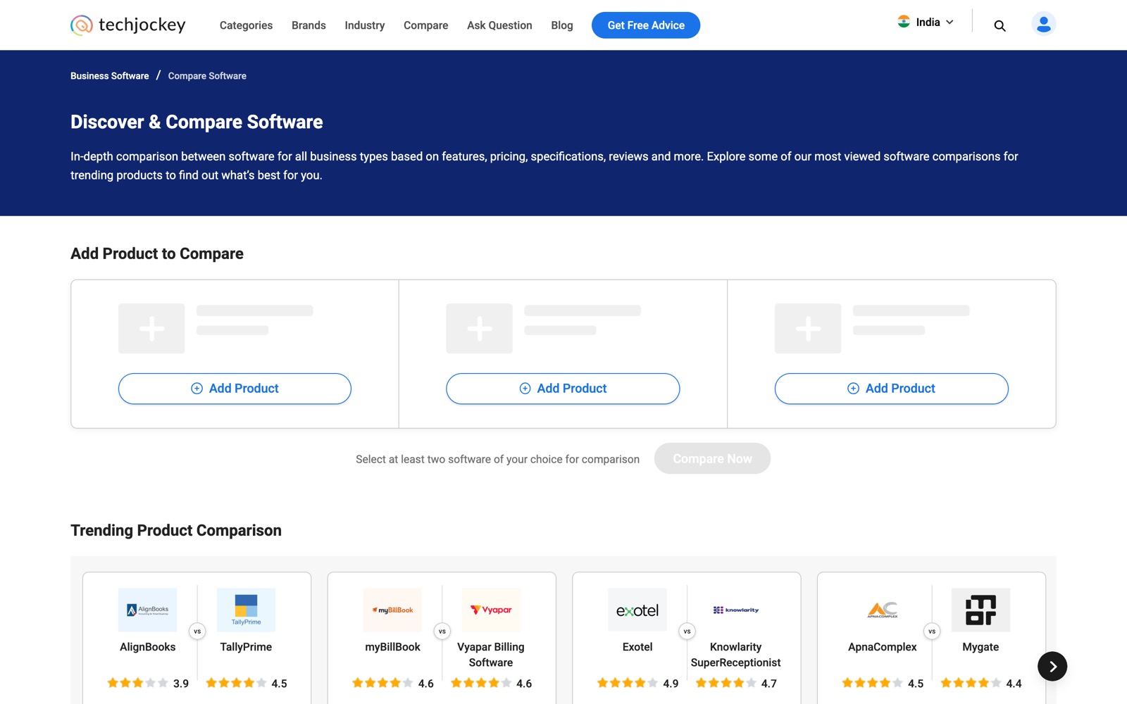
When a buyer adds products to compare, the page suggests alternatives to the first one, so a comparison never starts from a blank slot.
A quick view first
Ratings and reviews, platforms and recommendation score side by side. Data one product lacks is marked as not available, and a row no product has is hidden.
Pricing you can act on
The main plans for each product with a link to the rest, or Price on Request with a Get Price button. Ticks for Techjockey Verified, Free Trial and Lifetime Plan.
Reviews, pros and cons
Recent reviews and short pros and cons for each product, each linking to the full review.
Best use for
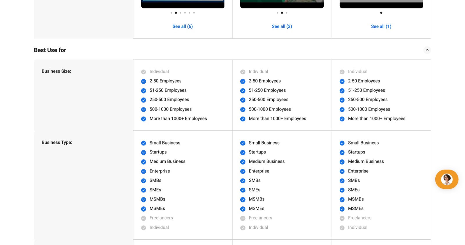
Business sizes and types for each product, so "who is this for?" has an answer.
Features only when comparable
The standardised feature grid appears only when every product is described against the same standard list; otherwise the page shows a plain feature view.
One lead action
Get Free Demo for software, Get Free Call for hardware, plus a downloadable comparison the buyer can keep.
Key decisions
Like-for-like or nothing
Data honesty- Rows and feature grids show only what can be compared: a row nobody has is hidden, and standard features appear only when all products share the standard list.
- Impact
- A tick means the same thing in every column, so a buyer can trust a difference they see.
Who it's for, from evidence
Decision support- Compare 3.0 answers "who is this for?" from who actually uses and reviews each product, not from the vendor's own description.
- Impact
- "Is this built for a business like mine?" gets an answer a buyer can trust.
One next step
Conversion- Two competing buttons became one lead button that matches the product type, and the downloadable comparison gives the buyer something to keep.
- Impact
- A buyer weighing two products has one obvious next step.
Screens
 (opens full size in a new tab)
 (opens full size in a new tab)
Want to talk through this?