Category page · Techjockey · Shipped · 1 min read
Category pages that show the options worth seeing first
How do you help a buyer facing hundreds of products in a category see the few worth considering?
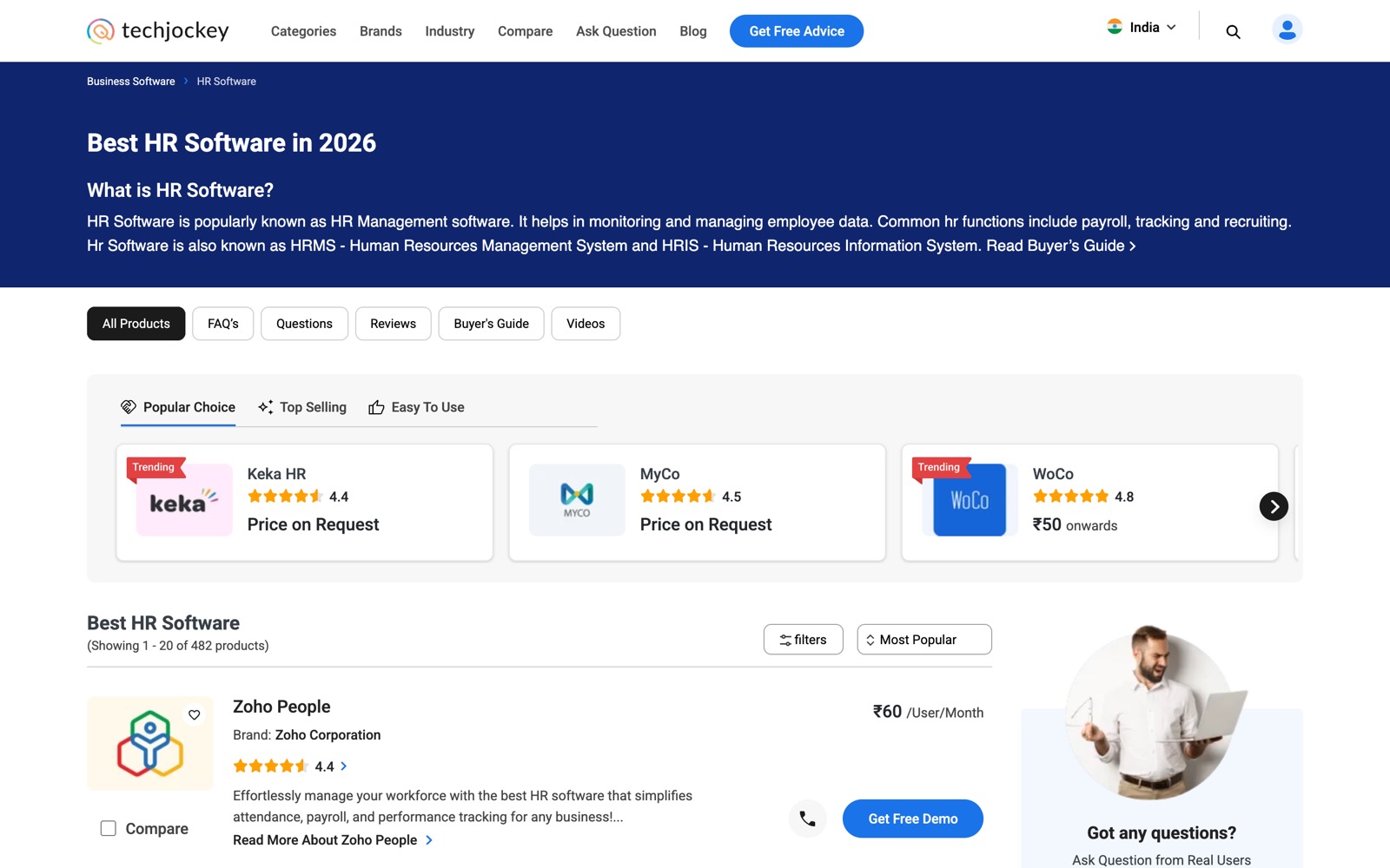
I rebuilt the template behind every category and listing page: a short intro and the buyer's guide up front, curated modules that show only when they have something to show, filters in one place and fewer, clearer sort options. It is the first page of the revamp that took organic conversion from 2% to 4.5%.
 (opens full size in a new tab)
At a glance
- Organic conversion, across the category, product and compare pages
- 2% → 4.5%
- Inorganic conversion, same three pages
- 6% → 12%
- Composite engagement score from the ranking and sort A/B test
- +35%
- Role
- Product Manager · User pod lead
- Context
- Shipped at Techjockey
- Format
- Spec · desktop + mobile web
- Stack
- GA4 · Hotjar · Microsoft Clarity · Figma · Zeplin · Jira
The problem
A category page answers "what are my options?". Some categories list hundreds of products. The old page put them in one long list with too many ways to sort it, and the modules above it showed whether or not there was anything good to put in them.
What changed
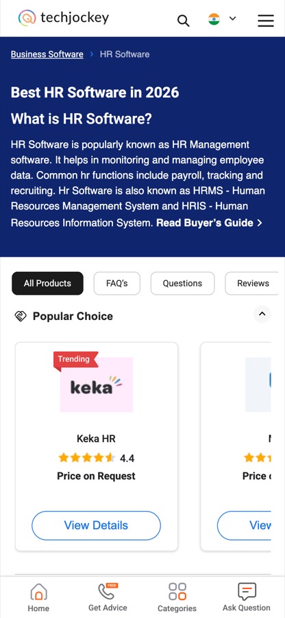
From the Category Page Revamp spec, for desktop and mobile web.
One template for every listing
Category pages and the related listings (alternatives, search results, industry and more) share one template, so they look and work the same.
Orientation first
The first fold is a short intro to the category and a link to the buyer's guide. Section tabs become a sticky bar as you scroll.
Curated modules
Popular Choice, Top Selling, Trusted Seller and Easy to Use sit above the full listing, each shown only when it has enough to show.
Fewer, better controls
Filters moved into one pop-up, Most Popular became the default, and the sort menu was cut down to the options buyers used.
Ranking, tested
The product ranking and sort order were A/B tested against engagement before they became the default.
Key decisions
Hide, don't fill
Content rules- A module that can't be filled well merges with another or disappears, and controls show only when there is something to control.
- Impact
- A thin category looks shorter, not broken. Buyers aren't shown half-empty shelves.
Sponsored, kept apart
Monetisation- Paid products get their own, labelled module instead of being mixed into the listing.
- Impact
- Paid visibility stays separate from the organic listing instead of quietly reshuffling it.
Fewer sort options
Decision friction- Most Popular is the default, backed by the ranking that was A/B tested.
- Impact
- The composite engagement score rose 35% in the test, and the default order became one the page could defend.
Screens
 (opens full size in a new tab)
Want to talk through this?