Product page · Techjockey · Shipped · 2 min read
Product pages that answer "is this the one?"
How should one product page serve a paid listing and an unpaid one, without misleading the buyer on either?
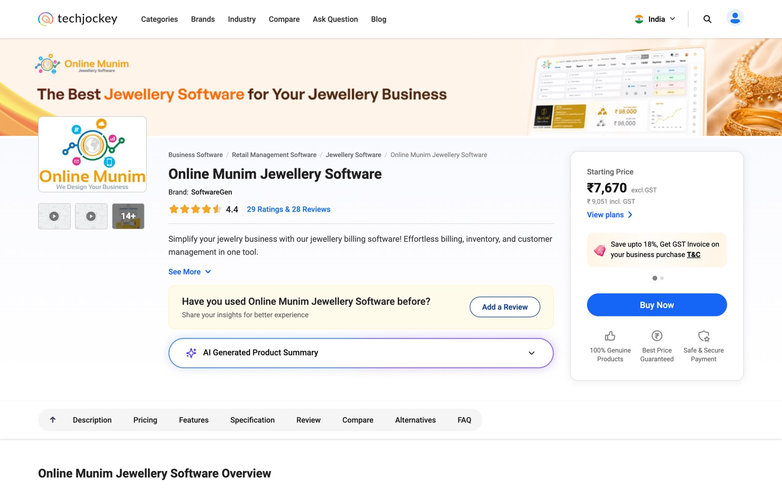
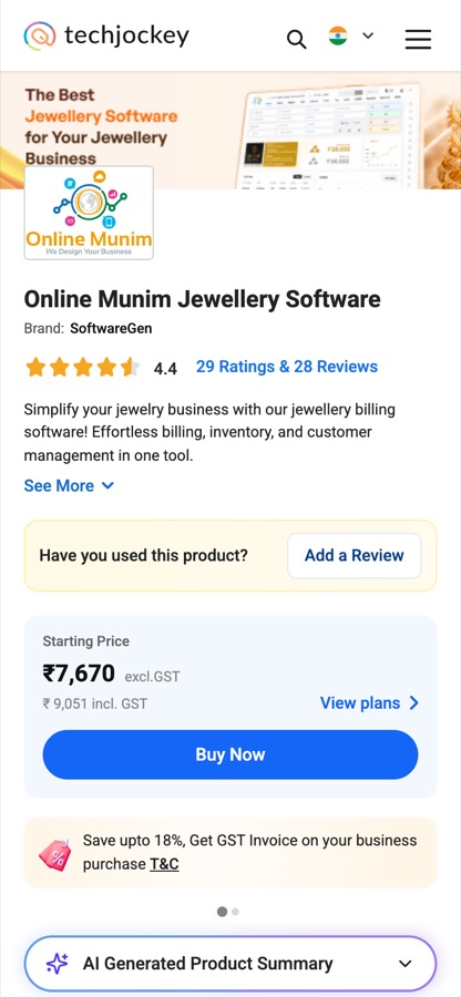
I specced two generations of the product page. PDP 3.0 was part of the revamp that took organic conversion from 2% to 4.5%. PDP 3.1, live in August 2026, adds a first fold for each kind of product, an AI summary shown only when the product has enough data, alternatives grouped by business size, and one primary call to action.
 (opens full size in a new tab)
At a glance
- Organic conversion, across the category, product and compare pages
- 2% → 4.5%
- Inorganic conversion, same three pages
- 6% → 12%
- Role
- Product Manager · User pod lead
- Context
- Shipped at Techjockey
- Format
- PRD · desktop + mobile web
- Stack
- GA4 · PageSpeed Insights · Figma · Jira
The problem
A product page answers "is this the one?". It also has to work for every kind of listing: some products can be bought outright and some only quoted, and some pages have lots of data while others have almost none. The older page handled all of these with one layout, so empty sections, competing buttons and missing prices showed up exactly where a buyer was deciding.
What PDP 3.0 and 3.1 changed
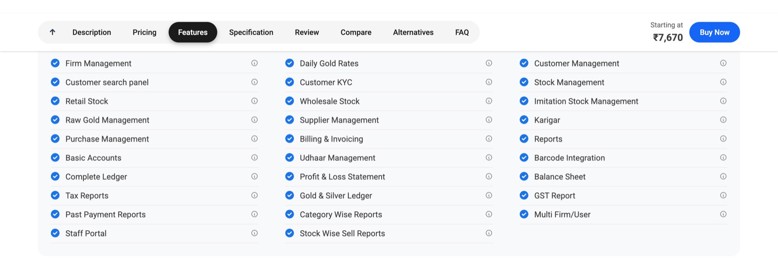
PDP 3.0 added a cover video, awards and downloads, and Q&A on the page, and reused the category page's sticky section menu. PDP 3.1, for desktop and mobile web, rebuilt the page section by section:
A first fold for each kind of product
The layout adapts to the product, and every combination of buttons comes down to one primary action: Buy Now, Get Quote or Free Forever.
Trust markers that match the action
Genuine products, best price and secure payment when the product can be bought now; delivery and free consultation when it can't.
AI product summary
A collapsed summary written only from the product's own description, features, specifications and integrations, shown only when there is enough to summarise.
Pricing that never shows an empty box
With no plans to show, the section becomes Price on Request with a Get Price button, or a Free Forever plan.
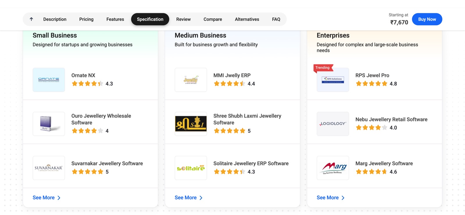
Alternatives by business size
Small, Medium and Enterprise columns, so a buyer sees options built for a business like theirs.
Reviews, summarised
An AI summary written only from real reviews, with positives and negatives. A product with no reviews yet points to reviews of similar products, then asks for the first review.
Key decisions
One primary action
Conversion- Every product state maps to a single primary call to action, and the sticky bar repeats it with the starting price.
- Impact
- A buyer always knows the next step, and the sticky bar keeps it in reach as they read.
AI only where the data holds it up
AI content- The summary uses only the product's own data and makes no claims beyond it. A missing rating or score is hidden, not estimated.
- Impact
- The summary can be trusted because it can't invent. Thin listings simply don't get one.
Sponsored, and labelled
Monetisation- Sponsored products among the alternatives carry a Sponsored label.
- Impact
- Vendors can buy visibility without misleading the buyer. The page stays useful to the buyer who isn't buying from them.
Result
Organic conversion rose from 2% to 4.5% and inorganic from 6% to 12% across the category, product and compare pages, revamped together as one journey.
Screens
 (opens full size in a new tab)
 (opens full size in a new tab)
 (opens full size in a new tab)
Want to talk through this?