Home page · Techjockey · Shipped · 2 min read
A home page that remembers what you looked at
How should a marketplace home page treat a first-time visitor differently from one who is already comparing products?
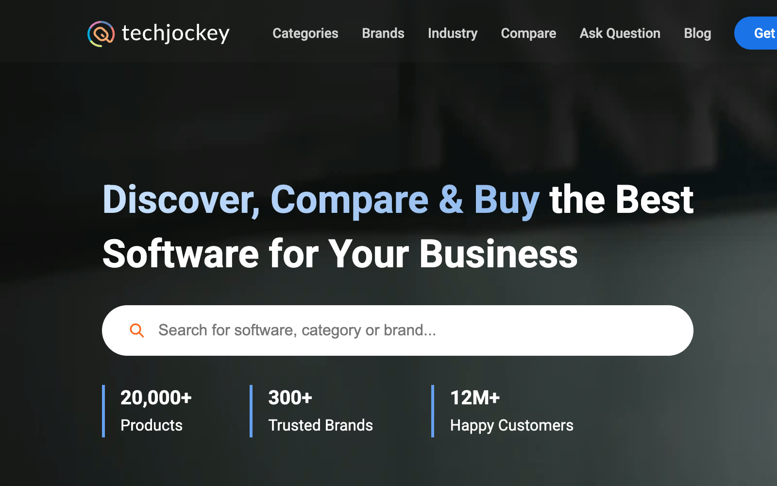
I specced Home 3.0 around one rule: personalise only on evidence. A first visit gets categories, the top products in each and a way to talk to an expert; a returning buyer gets back to what they were weighing. Every card shows the same price, label and products as the page it links to.
 (opens full size in a new tab)
At a glance
- Home 3.0 live
- Sep 2025
- Role
- Product Manager · User pod lead
- Context
- Shipped at Techjockey
- Format
- PRD · desktop + mobile web
- Stack
- GA4 · Figma · Jira
The problem
The home page is where buyers land before they know what they want. But a first-time visitor and someone halfway through comparing products saw the same page, and the products and prices on it didn't always match the pages they led to.
What changed
Home 3.0, for desktop and mobile web. The header and search stayed as they were: they worked, so the revamp left them alone.
Reasons to stay, one at a time
Below the fold, short sections appear one by one as you scroll: compare software, get expert advice and secure payments.
Popular categories
Category cards that say what each category is for; the whole card links to its category page.
Software by Category
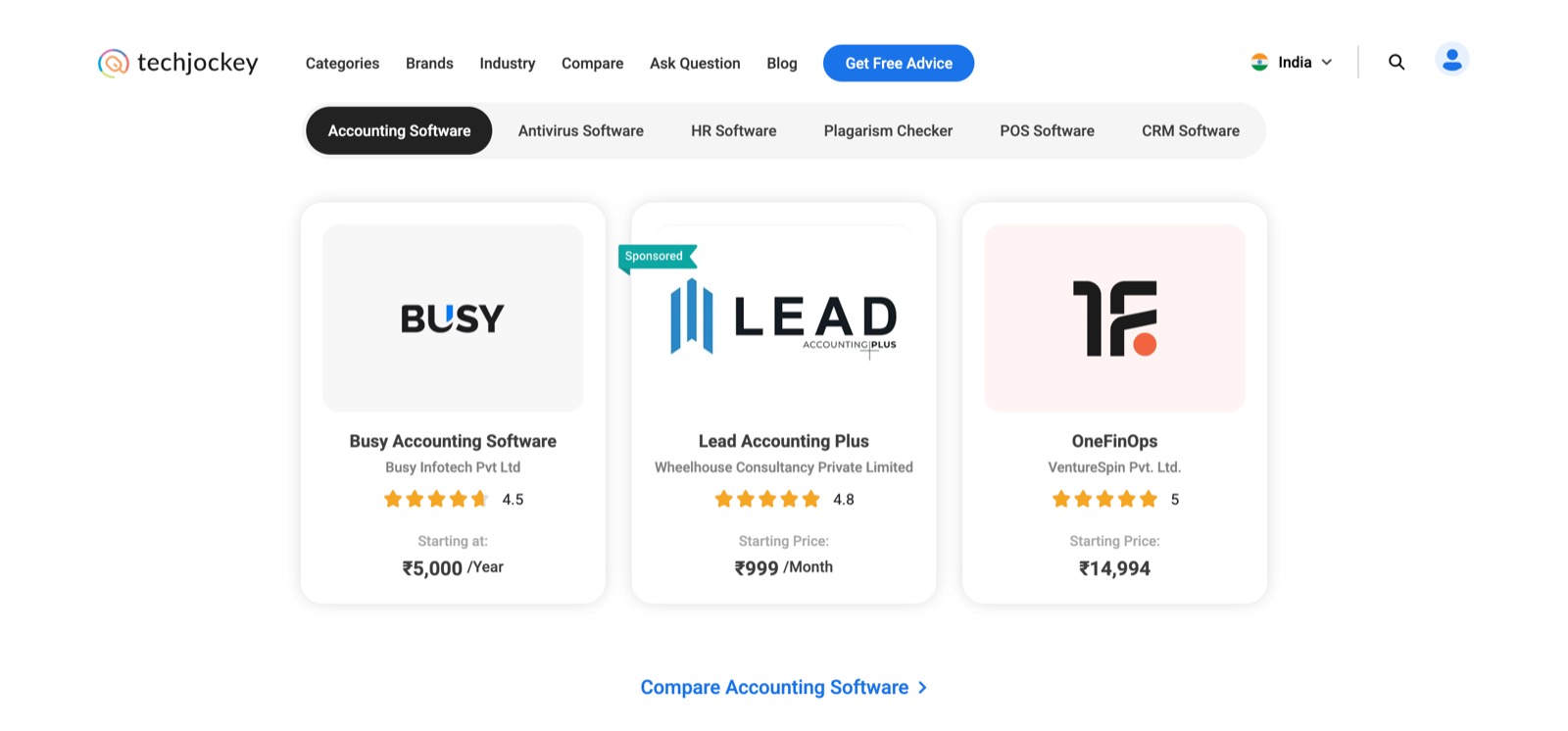
Category tabs, each showing the top products from that category page, with one link that compares them.
One price everywhere
Every product card shows the same starting price, discount and label as the product page it opens.
Deals, trending and proof
Current deals, trending and top-selling products, and customer testimonials.
Returning visitors
Recently viewed and recommended products, shown only to visitors with browsing history behind them.
Mobile
One card at a time, so a carousel never shrinks to unreadable cards.
Key decisions
Personalise only on evidence
Returning visitors- Recently viewed and recommended products appear only once a visitor has looked at products, and the recommendations build on what they viewed.
- Impact
- A first visit isn't padded with guesses, and a returning buyer is one click from what they were weighing. It is the same "hide, don't fill" rule as the category, product and compare pages.
Match the next page
Consistency- Cards take their price, discount and label from the product page, and Software by Category shows the same top products as the category page.
- Impact
- What a buyer clicks on is what they find. No price or ranking changes between the home page and the next page.
Ask for the lead where intent is
Lead capture- Expert advice opens the lead form; product cards go straight to the product page.
- Impact
- Lead capture sits beside the content of a buyer who wants help, not in front of one who is still browsing.
Screens
 (opens full size in a new tab)
Want to talk through this?